|
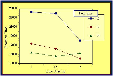
by Stayce Williams and Dr. Lauren Scharff This experiment examined the effects of line spacing and font size on the readability of text displayed on computer screens. A 3 (line spacing: single, one and a half, and double) x 3 (font size: 10, 12, and 14) within-subjects design was used. Fourteen participants located a target word (circle, square, diamond, triangle, or star) that was embedded in a paragraph of text; once the target word was located, participants clicked on (using the mouse) the corresponding shape at the bottom of the screen. Reaction times (RT) were recorded and used to infer readability. For each subject in each condition, median RTs (using only correct responses) were calculated and then used in a within-group ANOVA. Significant main effects were found for both line spacing (F (2,22) = 8.24, p<.01) and font size (F (2,22) = 3.92, p<.04). Single line spacing (mean = 220sec) was found to be read significantly slower than 1.5 spacing (mean = 158sec) and double spacing (mean = 150sec). Size 14 font (mean = 157sec) was read faster than size 12 font (mean = 182sec) and size 10 font (mean = 189sec), but significance was only found between the responses to size 10 and size 14 fonts. While the interaction was not significant, font size 10 was much slower than the larger fonts only for the single and 1.5 line spacing. In conclusion, these results suggest that designers should use at least a font size of 12. Although, HTML does not currently support 1.5 or double line spacing, it seems that readability of smaller-font displays would be improved if such formats were supported.  Figure 1: The effects of font size and line spacing on reaction time. Note: Reaction Time is given in milliseconds.
|