Full Reference: Hill, Alyson. (supervised by Scharff, L. V.) (1997). Readability of screen displays with various foreground/background color combinations, font styles, and font types. Proceedings of the Eleventh National Conference on Undergraduate Research, Vol II, 742-746.
|
The effects of 6 foreground/background color combinations (color), 3 font types (Arial, Courier New, & Times New Roman), and 2 word styles (Italicized & Plain) on readability of websites were investigated. Participants (N=42) scanned simulated websites for a target word; readability was inferred from reaction time (RT). An ANOVA showed significant main effects for color and font, and several significant interactions (Figure 1). A control experiment (N=21) using black text on shades of gray (to increase generalizablity to Internet browser settings), also found significant main effects for background gray level and style, and several interactions (Figure 2). In general these results suggest that there is no one foreground/background combination, font, or word style which leads to the fastest RT (i.e. best readability), but rather a designer must consider how each variable affects the other(s). To see results of other studies in our lab investigating readability of GUIs, please click here.
|
(This work was completed in 1997.)
We are depending more and more on computers everyday. We can receive our mail, read our newspapers and magazines, do our research and shopping all on our computers. The Internet is greatly responsible for these capabilities. Today, anyone can make a website and have it put on the Internet. The result of this freedom may often be very creative webpages, but also frequently hard to read webpages. Many novice designers may feel that if they can read their display, so can everyone else. This can be a problem, especially when the designers are young and the readers are older. More specifically, younger viewers usually manage to read even the worst video display terminal (VDT) designs, but this is not always true for the older readers (>45 years) or those with a color-perception deficiency (colorblindness).
Legibility, and in turn readability, of the VDT is very importantf or efficient communication. Legibility depends on many factors:color combinations, background texture, font, font size, word style (bold, italicized, etc.), computer pixel size, along with many others. There are plenty of opinions, preferences, observations, and even proposed algorithms related to legibility, but very little published, objective data that directly relates to webpage stylescreen displays. Despite the small amount of objective data, several legibility factors are acknowledged by books discussing on-screen displays. Unfortunately there is often little, if any, agreement across different publications. For example, although many of the design books do agree in their recommendations for "high contrast,"there is very little agreement regarding other variables that influence good screen design.
Contrast is very important in any written text. Whether in print or on screen displays, low contrast can be irritating and fatiguing to young readers, but for older readers and the colorblind it can be impossible to read. Contrast is the value (intensity) difference between two areas; the value is the amount of lightness or darknessin a color. For example, black on white has a high contrast, while black on gray has a lower contrast. There is much confusion when discussing contrast and color. Saturated green (little white light) on saturated red has a very low contrast, but green on red could havea high contrast. For example, one can place a fully saturated greenon a red that is almost pink by adding white light.
Also, when discussing color, one must acknowledge difficulties when presenting information using short wavelengths (i.e. blues). First, short wavelengths have lower resolution because they are blurred by the ocular media, and there is lower sampling by the cone mosaic. Thus, readability of any text presented in short-wave light will be decreased. Second, it is inadvisable to mix colors that are on the extreme ends of the color spectrum (i.e. blues and red). When the spectrally extreme colors are mixed they quickly fatigue theeyes, because these wavelengths have different focal lengths. Reds have long wavelengths, and they are focused farther back in the eye, unlike blues which have short wavelengths and are focused closer to the middle of the eye. This causes a sort of 'tug of war' in the eyes between focusing on the red and focusing on the blue. (For an excellent discussion of human color vision and how it affects computer displays, see Galitz, 1994).
For the novice designers, contradictory information in books written for professional designers can pose difficulties for their design process. For example, Powell (1990) suggests "avoid sharp contrast between foreground and background...," but Rivlen, et al. (1990) suggests "choose a text colour/background colour combination which maintains a high contrast..." Dumas (1988), warns us to stay away from "placing shades of blue beside each other," yet in another text, cyan text on a blue background is listed as a good color combination (Rivlin, et al, 1990). One text even listed such foreground/background color combinations as green on red, "bright white" on white and yellow on white as "good choices" (Powell, 1990). Powell also said that black text on white background was only acceptable "when used in a limited area;" however black on white has been the most recommended color combination found across all books. Pace (1984) found that blue on white had low error rates, but Powell regards blue text as a "poor choice." These are just a few of the many contradictions that can be found in design books. These contradictions are very confusing and quite overwhelming, and make it difficult to answer a simple question such as "what colors do I use on my webpage?" Even worse, what if someone only refers to one book (which most people would do), and that one book is the one that suggests green on red or yellow on white?
Information on paragraph style, word style, and font type of VDT's is a little harder to come by than information on color and color combinations; but fortunately this information is less contradictory and less vague than that regarding color use. Most of the information on font type and style came from research using printed text on paper. VDT design books still refer to this research. However, Krukand Muter (1984), found that text displayed on VDT's is "20-30 percent slower" to read than printed text (reading speed is used to infer legibility).
Regarding paragraph style, left justification is favored to rightjustification. Justification simply means to be lined up, and text can be either lined up on the left margin, right margin, both or neither (if text is centered). Trollip and Sales (1986) found a 10% increase in reading time with text that was both justified. This finding was attributed to "uneven spacing between words and/or frequent hyphenation;" plus, right justification makes it harder for a reader to find their place when they lose it (Dumas, 1988).
Several word style factors (letter case, bold, italicized, etc.) may also affect readability. For example, text displayed in mixed upper and lower case letters is faster and easier to read (Tinker,1963). This increase in speed is due to a person's tendency to recognize the shape of the word as opposed to each individual letter in a word. When text is in all upper case letters, it takes away the characteristic shape of words. The reader is forced to identify the individual letters of each word, which slows the reader down.
Additionally, font type can affect readability, depending upon if the letters contain serifs or have proportional spacing. Serifs are the little marks at the end of letter strokes; hence, serif fonts have serifs and sans serif fonts do not have serifs. Some examples of serif fonts are Times New Roman and Courier New, and an example of sans serif font is Arial. There is some contradictory research regarding the use of serifs. Horton (1990), warns against serif fonts in smaller font sizes, but Tinker (1964) says that fonts with serifs can be read more easily. Much of this contradiction comes from the generalization of research conducted for legibility of text on paper, to the legibility of text on VDT's.
Finally, letter spacing, proportional or non-proportional, can influence readability. A non-proportional font gives the same amount of space for an 'i' that it gives for an 'o,' while proportional fonts give an 'i' a smaller space than an 'o.' Courier New is a non-proportional font, and Times New Roman and Arial are proportional fonts. Helander et al. (1984) found that proportionally spaced type is read faster than "fixed-width" font.
As mentioned earlier, there are very few objective studies published on this topic, especially with respect to interactions among the factors which influence readability. It is not feasible to test every combination of variables, and since there has been so little prior research, we will start with a few basic variables: foreground/background color combinations, font type, and word style. The foreground/background color combinations chosen for this experiment are black on white, yellow on blue, black on gray, white on blue, green on yellow, and red on green. Times New Roman (TimesNR), Courier New, and Arial were used for font type, and italicized and Roman (plain) were used for word style. The current experiment placed these variables in a webpage style design in order to be more generalizable. Due to previous research we predicted that text with higher foreground/background color contrast would have faster reaction times. Text written in plain word style and sans serif proportional font were also predicted to have faster reaction times. Overall, it is predicted that as legibility increased, reaction time would decrease. Although interactions of some sort are expected, no particular trends are predicted.
METHODS
Participants
Forty-three participants were included in the current experiment. All participants except two, the advisor and the experimenter, were naive to the hypotheses. All participants were tested for normal color-vision, and all participants had 20/20 or corrected to 20/20 vision. Participants were informed of the required procedure and completed a consent form.
Apparatus
Macintosh Power PC 7200/120 computers were used in the experiment. The stimuli were created in B/C Power Laboratory (an experiment application), which also presented the stimuli and collected thedata. Data analysis was performed using Statistica (a statistics application).
Stimuli
A nation-wide Internet survey was used to help chose the foreground/background color combinations. Six color combinations were selected: yellow on blue (Y/BL), white on blue (W/BL), red on green (R/GN), black on gray (BK/GY), black on white (BK/W), and green on yellow (G/NY). These color combinations were chosen for a few basic reasons. First, basic colors that are available on most monitors were selected. Second, thee xperimentor selected two light on dark color combinations (W/BL andY/BL), two dark on light color combinations (BK/W and GN/Y); the fifth color combination, red on green, is not easily classified as light or dark. Finally, black on gray was chosen because it is commonly used on webpages. The RGB value of the colors used in this experiment are as follows: red-R(56797), G(0), B(0); blue- R(0),G(0), B(56797); yellow- R(65535), G(65535), B(0); green- R(0),G(34952), B(0); gray- R(30538), G(30538), B(30538); black- R(0),G(0), B(0); white- R(65535), G(65535), B(65535).
Within each color combination, there were three font types (Arial-sans serif/proportional; Courier New- serif/non-proportional; TimesNR- serif/proportional), and within each color/font variation, there were two word styles (italicized and plain). Thus, there were six font/word style variations within each color combination. Each font/word style combination within each color combination was presented five times, so that there were thirty trials per color combination, and a total of 180 trials in the experiment.
Thirty text stimuli were presented in each color combinations. Within each color combination condition the thirty texts were counter-balanced across each of the font type/word style combinations. More specifically, the text stimuli consisted of thirty text excerpts that were imported from the Internet into B/C PowerLaboratory. The thirty text pages ranged in length from 130 to 150words (some text were edited to fit within the word range). A target word was placed within each text; the placement was carefully randomized across all trials. At the bottom of each stimulus screen, there were five shapes that corresponded to each of the five target words (circle, triangle, star, diamond, and square).
Procedure
All participants were screened for normal color vision. Then, they read instructions on the computer screen, and they signed their consent form. They were given ten practice trials, and they were allowed to ask questions at any point throughout the experiment. The order of the practice trials and the 180 actual trials were randomized by the computer.
Participants were instructed to scan a screen of text and find a target shape word. Once they found the target word, they clicked on (using the mouse pointer and mouse) the corresponding shape at the bottom of the screen. The start of each trial was self-paced, and each trial ended when the participant clicked the target-word shape. Participants were instructed to respond as quickly and accurately aspossible. It took participants anywhere from 45 minutes to 2 hours (average time was one hour) to complete the experiment. After the experiment, all participants were debriefed.
RESULTS
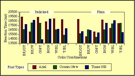
The data were sorted by each variable for each participant, and the mean for each condition was calculated (only RT's from correct responses were used). All participants with an overall accuracy rateof at least 95% were used. However, the data of two of these participants were not used due to RT patterns that implied that they were not diligently attending to the task. Figure 1 illustrates means for all conditions.
Figure 1: A 3-way interaction between color combinations, font types, and word styles. Notice how the performance on one variable isdependent on other variables.
Results of a 3-way with-in groups ANOVA showed a significant main effect of color combination (F (5,200) =2.27, p<.05). GN/Y had the fastest RT (x=16457.98), and R/GN had the slowest (x=17894.07); all other color combinations fell between with close RT's. Times NR font type (x=16746.87) was significantly faster than Arial (x=17700.85; F(2,80) =3.19, p<.05).
There was a significant two-way interaction between color combination and font type (F (10,400) =3.07, p<.001); GNY/Courier New (x=15252.84) and GNY/Times NR (x=15411.96) had the fastest color/font interaction RT's, with GNY/Arial (x=18709.13) and RGN/Courier New (x=18883.66) having the slowest RT's. The reaction time of other font types also depended upon color combination. The interaction between font type and word style was also significant (F(2,80)=5.25, p<.01). Arial/italicized (x=18517.42) was significantly slower than Times NR/italicized (x=16637.74), TimesNR/Arial (x=16856), and Arial/plain (x=16884.28).
Finally, there was a significant three-way interaction between color combination, word style, and font type (F(10,400)=3.25,p<.01; see Figure 1). These results show that there is no one font or one color combination to use, but rather there are certain fonts that work better with certain color combinations. Although word style shows some interaction with other variables, generally plain word style is faster than italicized word style. An interest in the black on gray color combination developed once the data for the experiment was analyzed. Black on gray is the default for a popular Internet browser, and the question was posed if black on white would be a more"user friendly" color combination.
In an attempt to answer this question, a control experiment was setup to compare black on white to black on four variations of gray.The colors combinations used were black (RGB=0) on white (RGB=65535), black on light gray (RGB=56797), black on medium gray (RGB=48059), black on dark gray (RGB=30538), and black on very dark gray (RGB=21845). "Medium gray" is the Netscape default, and "dark gray"is the gray used in the original experiment. This experiment used the exact same setup as the previous experiment, with the exception of not using Courier New font type, and 10 of the 30 text selections were eliminated. There were twenty-one participants, and it took them thirty minutes to one hour to complete the experiment. The means for each condition are illustrated in Figure 2.
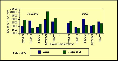
Figure 2: Means for all conditions (gray combinations, font types, and word styles). Plain text conditions are significantly faster than italicized. Again, performance on one variable is dependent on the other variables.
Surprisingly, black on medium gray (x=15215.21) and black on dark gray (x=16088.70) had significantly faster RT's than black on white (x=17176.3; F (4,80)=3.37, p<.01). Plain word style (x=16052.53) was still significantly faster than italicized (x=17025.69; F(1,20)=5.22, p<.03), and unlike before, there was no significant difference between the two fonts. There were significant two-way interactions between color combinations and font types (F(4,80)=2.46,p<.05). Times NR had more variability across color combinations than did Arial font type. The medium gray/Times NR combination had the fastest RT (x= 14350.80), yet very dark gray/Times NR had the slowest RT (x=18505.95). There were also significant interactions between color combinations and word styles (F(4,80) =3.06, p<.02). Very dark gray/italicized had the slowest RT (x=19647.46), and medium gray/plain (x=14497.40), and dark gray/italicized (x=15347.57) has the fastest RT's.
DISCUSSION
As predicted, significant main effects and interactions were found for font type, word style, and color combination. For example, plaint ext is consistently responded to more quickly than italicized. These main effects suggest that one can make general recommendations to screen display designers. However, the significant interactions highlight the fact that there is no one color combination, font type,or word style to use, but rather all conditions affect one another. In Figure 2, compare the results of Arial/italicized to Arial/plain. Notice how within each of the gray combinations, the results"flip-flop" between italicized and plain. This type of interaction was true of other variable combinations across conditions, which means a designer must consider a variable's influence on all other variables. This interaction of variables is not mentioned in current manuals; hopefully, future manuals will address such interactions.
From these results, one can say that contrast affects legibility, but unfortunately, it does not seem to be as simple as high contrast being better than low contrast. In the main experiment, GN/Y had the fastest RT's, and in the control experiment, medium gray, and dark gray had the fastest RT's. In neither experiment did the BK/W condition show the fastest RT's. These results show that these participants had faster response times when more median contrasts were used. These results supported Powell (1990), who suggested avoiding sharp contrasts, but did not fully support Rivlen et al. (1990), who suggested maintaining high contrast.
According to a manual by AT&T; (1989), the direction of the contrast (dark on light, or light on dark) might also affect legibility. When light text is placed on a dark background the text may seem to glow and become blurred; this is referred to as halation, and it may make the text harder to read. Some evidence for an effect of halation was found in the current experiment. The mean RT for light text on a dark background was x=17559.24, while the mean RT for dark text on a light background was x=16909.33. This finding might also be attributable to a subject experience factor due to the frequency of dark text on light backgrounds; more research is needed on this topic before any strong recommendations can be made.
Several of the contradictions discussed in the literature reviewwere addressed in this experiment. Powell (1990) suggested the color combination of red on green, and warned against black on white. Yet in the main experiment, red on green was found to be the worst color combination, and black on white to be one of the best. The results show significant main effects between the serif and sans serif fonts; which supports Horton (1990) and Tinker (1964). However, the results contradicted those of Helander et al. (1984), who found that proportionally spaced font was faster. In this experiment, Times NR (proportionally spaced) was faster than Courier New(non-proportionally spaced), while Arial (proportionally spaced) was slower than Courier New. There is no simple explanation for all the current findings, but, hopefully this research and further researchon this topic can and will be beneficial to webpage designers.
REFERENCES
AT&T.; "OPEN LOOK: Graphical User Interface Application StyleGuidelines." Sun Microsystems, Inc. New York. 1989.
Chinell, David F. "System Documentation: The In-Line Approach." John Wiley & Sons. New York. 1990.
Dumas, Joseph S. "Designing User Interfaces for Software."Prentice-Hall, Inc. Englewood Cliffs, New Jersey. 1988.
Galitz, Wilbert O. "It's Time to Clean Your Windows: Designing GUIs That Work." John Wiley & Sons, Inc. New York: 1994.
Helander, Martin G., Patricia A. Billingsley, and Jayne M.Schurick. "An Evaluation of Human Factors Research on Visual display Terminals in the Workplace." The Human Factors Review. Santa Monica, CA: Human Factors Society, 1984, 55-129.
Horton, William K. "Designing and Writing Online Documentation."John Wiley & Sons. New York, NY, 1989.
Kruk, R. S. and P. Muter. "Reading Continuous Text on Television Screens." Human Factors, 26, 3 (1984): 339-345.
Powell, James E. "Designing User Interfaces." Microtrend Books. San Marcos: 1990.
Rivlin, Christopher, Lewis Robert, & Rachel Davies-Cooper."Guidelines For Screen Design." Blackwell Scientific Publications.Oxford: 1990.
Schmandt, Christopher. "Color Text Display in Video Media." InColor and the Computer. Boston: Academic Press, 1987: 255-266.
Trollip, S.and Sales, G., "Readability of computer-generatedfill-justified text." Human Factors, 1986, 28, 159-164.
Tinker, M. "Legibility of Print." Ames, IA: Iowa State UniversityPress, 1969.